Tools for creating info visualizations

Tools for creating charts, maps, and diagrams

I recently taught a 1/2 day workshop at  WebSearch University in Washington DC on Visualization Tools for Turning Information Into Insights. At a conference that basically focuses on the search, my workshop covered delivering your results in a way that’s meaningful for clients. Our clients don’t crave more or better info. They’re drowning in it […]

0 comments

Make The Right Choice

What Chart Type to Use?

One of the biggest challenges when creating effective charts is deciding which type to use. I’ve found that the best way to choose the appropriate chart is to listen to the words in the message you want to convey. What types of comparisons are you making when looking at the data? For a recent workshop […]

0 comments

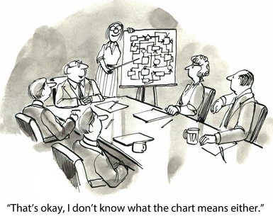
"That's okay I don't know what the chart means either."

4 Rules for Designing Better Charts

When you’re working with numbers, charts can be an effective way to tell your story. These types of visualizations simplify complex ideas and help us understand and communicate what’s relevant in the data. However, when your chart’s not done right, it will have the opposite effect. A poorly-designed chart can lead to misinformation, confusion, and […]

0 comments

Visualization: How to choose the right graphic

Displaying research results in a visual format adds impact and brings clarity where words often fail. Whether you’re creating an annual report, executive summary, or a presentation for your CEO, charts, graphs, and maps provide analysis and help readers understand and remember the information you deliver. When I lead workshops on information visualization (it’s not […]

0 comments
top