4 Rules for Designing Better Charts
When you’re working with numbers, charts can be an effective way to tell your story. These types of visualizations simplify complex ideas and help us understand and communicate what’s relevant in the data.
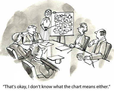
However, when your chart’s not done right, it will have the opposite effect. A poorly-designed chart can lead to misinformation, confusion, and bad decisions.
So, how do you make sure you’re designing charts that enhance rather than interfere with the story behind the numbers? Here are I my four top rules getting your message across with charts:
Make sure you really need a chart – Yes, everyone’s doing it. Infographics and charts are everywhere. But, please don’t use a visual format if a couple of sentences or simple bulleted list will do.
Less is more – As Edward Tufte said, “Above all else, show the data.” Reduce non-data ink by eliminating unnecessary labels, decimals, patterns, etc. Put yourself in the reader’s position and only include what’s needed to understand the message.
Avoid data distortion – 3-D, doughnut charts, and patterns detract from the data, and they make it difficult – if not impossible – to ensure the accuracy of your charts.
Keep it balanced – Avoid clutter, and use white space to your advantage. Space components such as columns in bar charts so they’re appealing to the eye and allow the data to pop.
If you’re in the vicinity of Washington DC on September 16th, be sure to attend my WebSearch University workshop, Visualization Tools for Turning Information Into Insights, for more tips and tools for designing charts and other visual formats!